Introduction to Flexbox
Helpful links
- An Interactive Guide to Flexbox - DO THIS INSTEAD OF THESE NOTES. MUST READ FOR FLEXBOX.
- Flexbox cheatsheet
- A Complete Guide to Flexbox
Flexbox
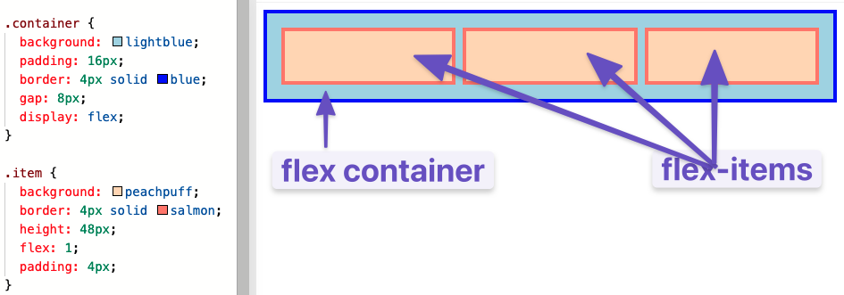
Input:
<div class="flex-container">
  <div class="one"></div>
  <div class="two"></div>
  <div class="three"></div>
</div>
.flex-container {
  display: flex;
}

.flex-container div {
  background: peachpuff;
  border: 4px solid brown;
  height: 100px;
  flex: 1;
}
Output:
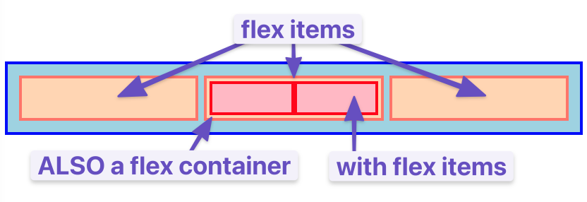
- A flex container is any element that has
display: flexon it. - A flex item is any element that lives directly inside of a flex container.
- Any element can be both a flex container and a flex item. Said another way, you can also put
display: flexon a flex item and then use flexbox to arrange its children.
Hypothetical size
- In Flexbox, some properties (like the
widthproperty) is implemented differently. It's more of a suggestion than a hard constraint. - This is a core part of the Flexbox philosophy. Things are fluid and flexible and can adjust to the constraints of the world.